![]() User experience design has become one of the most important disciplines in innovation.
User experience design has become one of the most important disciplines in innovation.
It’s key to creating great products!
And there a few frameworks that can help a lot for that.
In this post, you’re going to learn how you can use five of these UX frameworks to design better user experience.
In fact:
These are the frameworks that UX designers from companies like Facebook and Pinterest use to increase user engagement.
1. B.J. Fogg’s Behavior Model: The UX Equation of B = MAP
Objective:
The Fogg Behavior Model helps you take into account behaviour change when you create the UX of a product or service.
What it is:
This framework explains the cause of a specific behaviour with a simple model:
Behaviour = Motivation * Ability * Prompt (summarised as B = MAP).
In B.J. Fogg’s words:
“The [framework] shows that three elements must converge at the same moment for a behavior to occur: Motivation, Ability, and a Prompt. When a behavior does not occur, at least one of those three elements is missing.”
This means:
For a specific behaviour to occur, a person needs sufficient motivation, sufficient ability, and an effective prompt.
- Prompt = Do this now.
- Ability = You can do it now.
- Motivation = You want to do it now.
Make the three elements converge at the same time and a specific behaviour will occur.
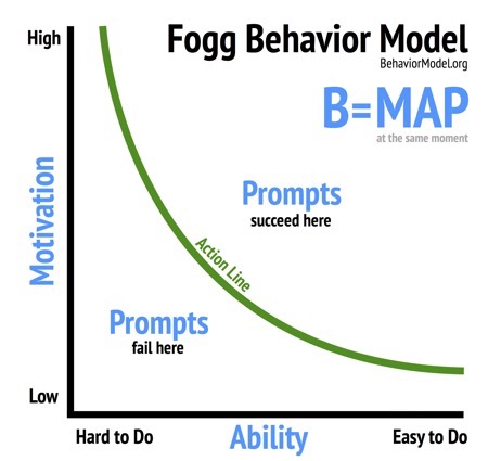
Of course, the model is a simplistic view of the reality. Human behaviour is far more complex. Many variables like culture and society also shape our behaviours.
But, in the context of designing user experience for behaviour change, having a simplified framework helps a lot.
The UX Nugget
As we see on the graph, action (behaviour) is a function of both ability and motivation.
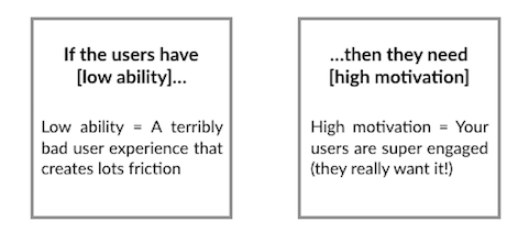
So if your UX is crap, you need to target an audience of highly engaged users. (This is what’s often called “early adopters”, i.e. people who really need what you’re helping them to achieve).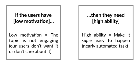
On the other hand, if you are targeting people who aren’t really engaged, you need to make it dead easy for them to take a specific action.
For example, users who have to deal with their expenses are really unengaged. The process, therefore, needs to be super easy, if not automated.
Put it into practice:
Here are three useful questions to help you as you design or review the user experience of a proposition:
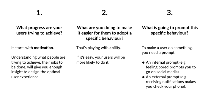
Use these questions to review each screen or interaction you created in your product.
Interested in the topic?
Get my new book, The Value Mix. There, you’ll find more examples and tools that help you design a better UX for your audience.
2. Nir Eyal’s Hooked Model: Create Habit-forming UX
Nir Eyal’s framework is an adaptation of the B = MAP equation.
Objective:
The Hooked model helps build what Nir Eyal calls “habit-forming products”.
These products are designed to drive user engagement.
How?
They create a user experience which encourage users to return and use those products over and over again.
What it is:
The idea behind the framework is that making your users go through the right steps can get to influence their behaviour.
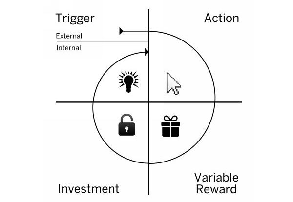
If you succeed to make them repeat that loop, they’ll start forming habits—the habit of returning and using your product.
How it works:
The loop based on the Hooked model consists of four components:
(1) Triggers:
External Triggers are the prompts that get users to your product.

Internal Triggers are the set of emotions and jobs to be done that your product addresses to encourage them to use your product.
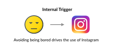
Both types of triggers should reinforce each other. The External Triggers are designed to leverage existing Internal Triggers.
(2) Action:
To encourage your users to take Action (i.e. a specific behaviour), you must reduce the level of friction. It means making it as easy as possible to perform this action.
This is the core of the B = MAP equation I talked about earlier.
(3) Variable Rewards :
Variable Rewards are about creating anticipations.
This is at the core of building habits.
Let’s break down the two components:
- You must find ways to include rewards that are fulfilling, yet leave the user wanting more.
- The best is when you make them variable, there’s an element of “nearly-predictable” surprise.
The combination of both generates a high level of anticipation from your users.
An example?
The Instagram News Feed.
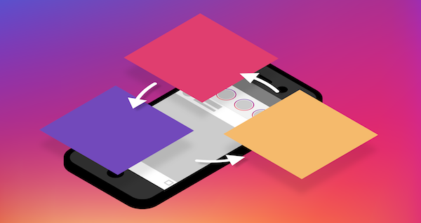
The Feed algorithm triggers user engagement over and over again. Every time you refresh the feed, it shows you recent and engaging updates from your friends (variable rewards).
And what’s more likely to make you react than photos of people you know?
Variable Rewards increase the level of dopamine. Users end up being more likely to get excited about performing certain actions, over and over again.
(4) Investment:
Investments are about helping your users turn your product into an asset (i.e. something that gains value as you input more effort and data into it).
Two cognitive phenomenons happen here:
- It’s a lock-in tactic. Investments increase the switching cost and make it more likely for your users to return.
- There’s a sense of escalation of commitment. The negative impact of switching to another product (loss of the investments of time, effort, and data) reinforces the value of the current behaviour.
You can read more about this framework in Nir Eyal’s book: Hooked: How to Build Habit-Forming Products.
3. The 6 Levels of User Experience
Objective:
The 6 Levels of User Experience helps your prioritise your workflow.
(Inspired from the Elements of User Experience.)
What it is:
There’s an optimal order to how you organise what you do to design the user experience of a proposition.
Don’t put the cart before the horse. :O
Indeed, each level of UX is informed by the level above.
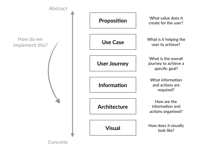
If you start working on one level before you’ve figured out the one above, it won’t make sense.
This is what Intercom calls the “dribbblisation of design”:
“Things that look great but don’t work well.”
Indeed, you cannot create a useful and easy-to-use interface if you work on the visual design before you’ve selected what information the user will need to see on it.
How it works:
You must make sure that you are clear on the most abstract level before you ask yourself:
“How do we implement this?”
The use case is clear?
So.. “how do we implement this?”
You create the user journey.
“How do we implement this?”
You need to define what information is needed at this level.
And so on, and so on…
I dive in this topic in more depth in my new book, The Value Mix.
You’ll find more examples and tools that will help you design a better UX for your audience.
4. Prioritising Your UX Design with the Proficiency Scale
Objective:
The Proficiency Scale is a framework that helps you prioritise the information and actions you show to your users based on their level of proficiency.
What it is:
The Proficiency Scale is inspired by Jason Fried’s distinction among three levels of priority:
“Much of the tension in product development and interface design comes from trying to balance the obvious, the easy, and the possible. Figuring out which things go in which bucket is critical to fully understanding how to make something useful.”
To create a great UX, you need to prioritise what you show to your users, where you display the actions and informations.
How it works:
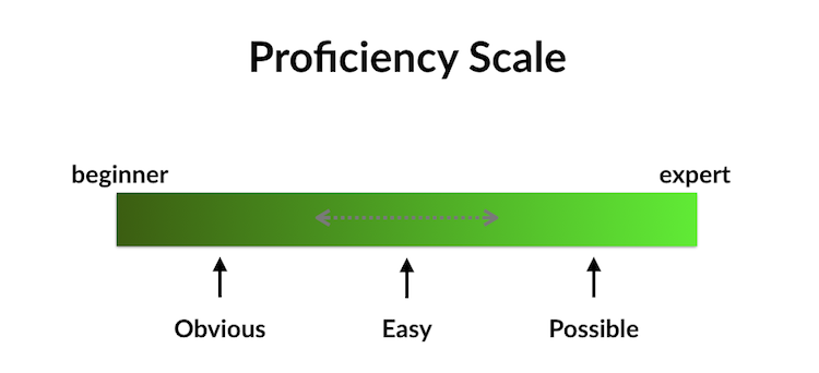
I designed the Proficiency Scale to illustrate that:
The level of proficiency of a user correlates with what needs to be obvious, easy, or only possible.
Let’s dig in:
If your user just started with your product, you should only show them what needs to be obvious.
As your user gains knowledge, he’ll be able to access what’s easy to do.
The last bucket, what’s possible, is for people who have become experts. These possible actions are more difficult to find, “hidden” in menus and shortcuts.
An example of the Proficiency Scale in software
For example, WordPress’s jobs go like this:
Get an idea => Draft a post => Edit => Publish.
The minimal level of proficiency should allow new users to accomplish at least all of these steps.
As educating new users (called “n00bs” here) is costly, WordPress has to make it feel intuitive. They emphasised and made obvious all the actions that you need to get the job of publishing an article done.
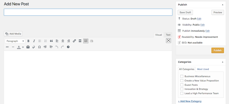
In this case, what WordPress needed to make obvious are the following actions: creating a draft, editing the draft, saving the draft, and publishing.
An example of the Proficiency Scale in hardware
Universal remotes are confusing.
The proof:
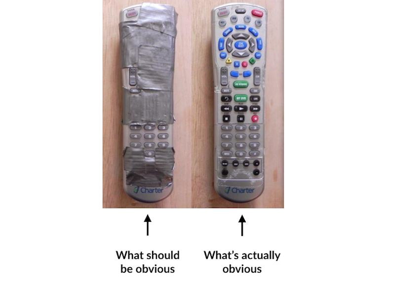
As you can see on the right, all the buttons that only an expert would use are made obvious.
On the right, the Duct tape highlights what should be obvious. The rest should just be easy or possible.
You immediately realise that: when everything is obvious, nothing is obvious. (And the UX gets confusing.)
So what should you do?
Make obvious only the core of what’s necessary to achieve a specific user goal.
5. The Familiarity Test
Objective:
The Familiarity Test is a UX design principle that helps you create a UX that your users will adopt intuitively by reducing the learning curve for your users.
What it is:
Familiarity is the degree to which users recognise elements of the user experience (including the user interface).
“Don’t try to change user behavior dramatically. If you are expecting people to dramatically change the way they do things, it’s not going to happen. Try to make it such that it’s a small change, yet an important one.”
— Sabeer Bhatia, Founder of Hotmail
A familiar UX allows your users to view their interaction with your product or service as natural and intuitive.
How it works:
Familiarity is based on the similarity with the propositions your users have interacted with in the past.
It works because using standardised interfaces reduces the learning curve. Your users can interact with your product without really thinking about how it works. That’s the power of being intuitive.
But it can limit what they can achieve.
Therefore, you need to balance familiarity with user benefits:
How much extra benefit do they get from the unfamiliar elements in your user experience?
An example of the Familiarity Test in hardware:
It’s been proven that the DVORAK keyboard yield a 30% speed improvement compared to a traditional QWERTY one.
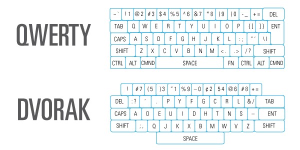
But for the majority of users, DVORAK is not familiar enough to justify the extra benefit.
Interested in the topic?
Get my new book, The Value Mix. There, you’ll find more examples and tools that help you design a better UX for your audience.